
|
Maayan Bobylev Coaching stands out by bringing synergy and empowerment through financial freedom. A sophisticated perosnal brand with a free spirit. 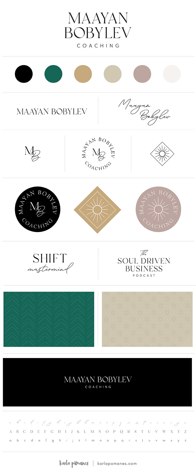
0 Comments
Are you familiar with the phrase “less is more”? This advice can be used across all walks of life, including brand identity. Last year I had an amazing opportunity to speak with over 50 people and got the chance to audit their brands. 🔎 Do you know what the most consistent problem I noticed was? Fonts. Most of the brands I audited were using too many fonts. Many of them included more than three styles, which is too many. I also recognized fonts that did not represent their brands properly or in the way they were wanting to present themselves to the world. 🌎 Every font has something to say beyond the words on a page or device. That's why it's important to think about your message and choose a font that fits best. 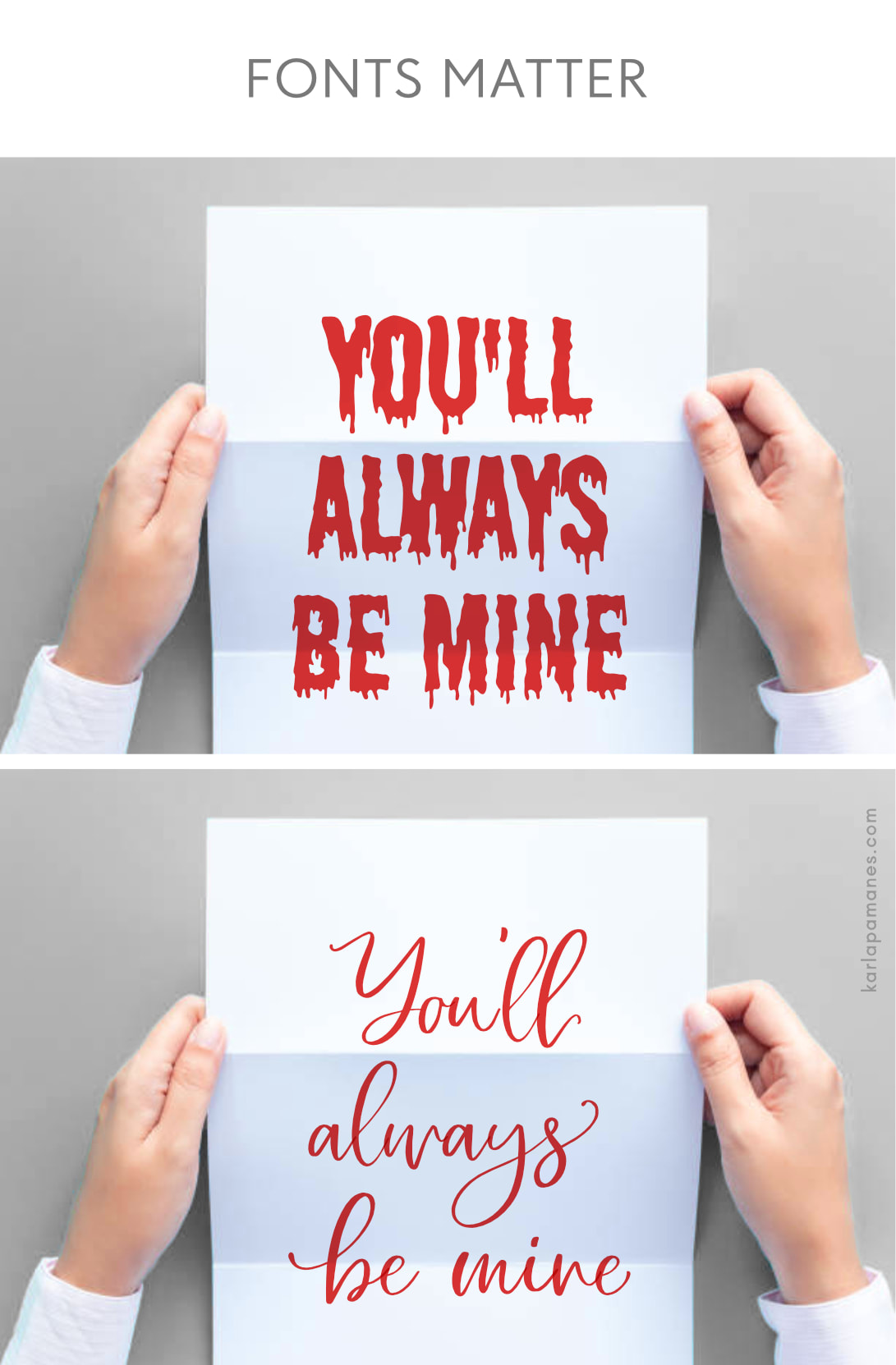 You should also think about where your brand is being seen. Some fonts are better for print-based projects like magazines or newspapers. Others are used because they are easier to read digitally on computers, smartphones, or tablets. I know this whole font talk might seem a bit overwhelming. So I would like to extend an invitation to you for a FREE 15 minute brand audit: https://www.karlapamanes.com/brand-design-audit.html Let’s take a look at what you have and how we can improve it! It’s important to put your best font-foot forward to represent your brand in a way that is authentic, original, and impactful. 🌟 Love, Karla |