|
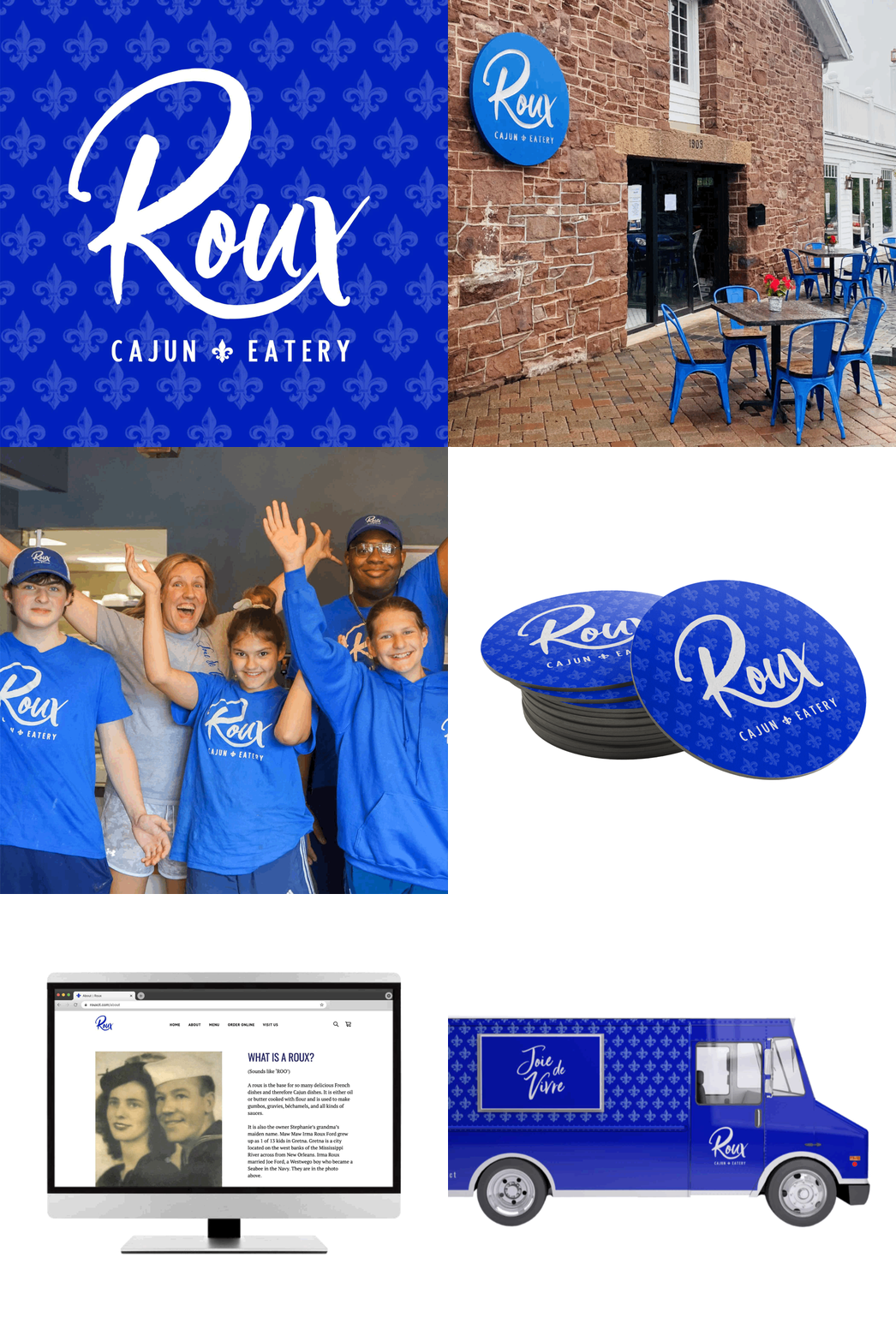
What do Starbucks, Sephora, Disney, and Apple all have in common? Yes, they’re all huge brands that basically dominate their respective industries, but I chose these companies because I think they all have an incredibly consistent brand identity. Listen, I know my goal should be to write about super interesting stuff on my blog to keep you interested and entertained, but today I want to talk to you about consistency. Yawn, right? As a graphic designer, I love playing with colors and fonts and all of that, but I would be doing my clients a disservice if I didn’t also spend a lot of time thinking about building them a consistent brand identity that will help them connect with their target audience. A consistent brand is SO important because it helps customers recognize you. This builds that know, like, and trust factor that is crucial for getting more sales. All of the well-known brands we obsess over understand this. Think about the brands I mentioned above: Starbucks - I don’t know about you but when I see the green apron with the mermaid on it, I can practically smell the coffee beans. People are *obsessed* with collecting their cups and if you spend five minutes on Instagram, you’ll see at least one photo of someone holding a latte or frap. They’re an internationally recognized brand because they’re soooo consistent. Sephora - Black and white stripes with a pop of red. It’s not a complicated brand identity at all, but it works! We know we’re looking at a Sephora store or shopping bag when we see those stripes! This is a great example of how simplicity can be super powerful in branding! You don’t need to constantly switch things up to keep people interested, and Sephora is proof. Disney - Disney has a strong visual brand, but they also focus a lot on the “experience” element of their brand. When you go to a park or even one of their stores in the mall, you know you’re going to have a certain type of experience. I’m sure they spend a lot of money training their team members to deliver this kind of consistent experience and it pays off big time for them. Apple - The entire reason that Apple broke through in their market can be traced back to their decision to keep things super simple. Their brand identity is sleek, clean, and uncluttered and you can see this in their products, their ads, and their stores. In my opinion, it’s one of the main reasons (or THE main reason) people pay so much money for their products! I would never call these brands boring just because they have a consistent brand. Sometimes, I will have someone reach out who has lots of ideas and wants to incorporate a lot of colors, fonts, and elements into their brand design and I just have to educate them a little bit on why I don’t feel that’s the best strategy for their business. They usually end up agreeing with me, especially once they see how NOT boring a really great brand identity can be! For example, check out all the different ways my client Stephanie Civitillo can use the brand identity I designed for her cajun restaurant, Roux, to create a consistent experience: You know that quote by Coco Chanel that says we should remove one accessory before leaving the house? I kind of agree, but with fonts and colors! So many people who DIY their brand make the mistake of doing too much, but I think a simple and consistent approach is usually better. Do you have any questions for me about branding and consistency? I always love hearing from you so feel free to leave a comment below and share your thoughts!
0 Comments
|
AUTHOR
Karla is an award-winning designer, branding expert and mentor. She has designed for brands including BRIT+CO, Discovery, HGTV, Food Network, Facebook, Kellanova and more. Her specialty is helping elevate brands through well-crafted brand and web design. ARCHIVES
June 2024
|

