
|
Halloween is right around the corner, and I’m celebrating a personal win. Join me on a journey back in time to last year, when I dressed up as a stressed-out single mom: 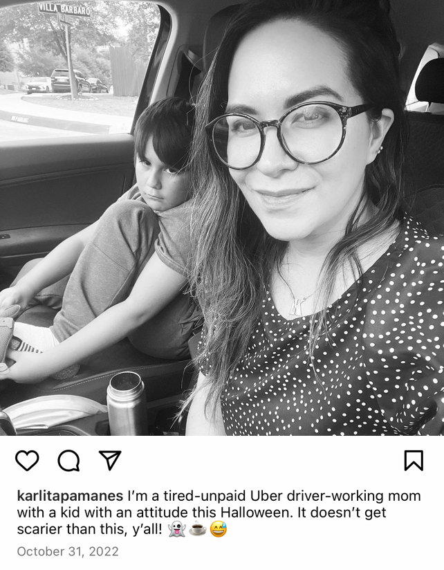 As you can see, I was making light of the situation in my caption but in all honesty, that was a bit of a tough time for me and for Lennon. But this year, I’m doing things differently. This year, I’m prioritizing fun. I ordered a wig and some stuffed cats and I made myself a “Crazy Cat Lady” costume. 😸😸😸 Instead of taking the easy way out and ordering the costume already made, I got a little bit crafty and I made it 100% my own. It’s been a while since I felt like I had the bandwidth to take on a project like this and it feels good to see my lighthearted side come out to play again! Of course, I also stocked up on all the fun-size Heath Bars (my fave!) and I made Lennon re-watch Coco with me! I’ve sat through enough Roblox YouTube videos this year to earn a “Mom’s Choice” movie night. 😆 And, we made this spooky house together! 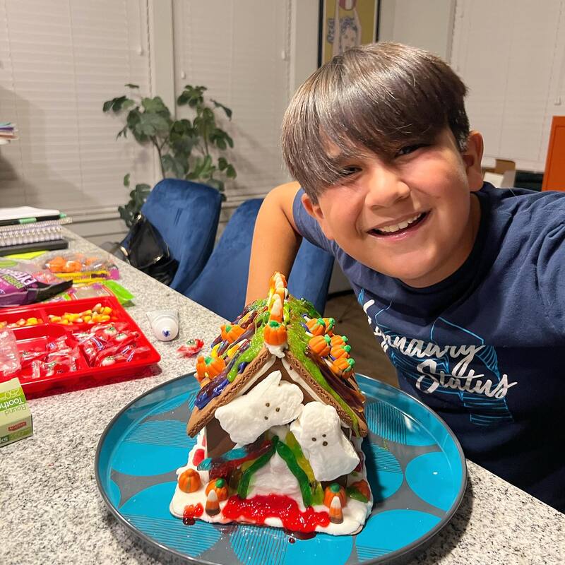 As you can see, I get very into Halloween. I love spooky season! I love going to Trader Joe's and buying all of the cute “scary” items and I love having fun with Lennon. But since this is a brand design blog, I want to talk about something that’s not cute OR fun… Scary branding. 👻 First off, I just want to say that I have nothing against people DIYing their brand design. That’s not what this blog post is about. What I’m talking about is branding that isn’t serving you *OR* your target audience. Branding that undermines your mission, talents, and really great ideas. I recently read that 60% of consumers will avoid companies with unappealing (aka scary) logos — even if that company has good reviews. It might seem like a random thing to care about, but clearly, we care a lot about how a brand looks! Here are a few examples of what I mean by scary branding: 🕸 The font is illegible or hard to read 🦇 The brand contains too many fonts 🎃 The colors clash with each other 🕷 The design is complex or cluttered ☠️ There’s no brand style guide 🪦 The design is meaningless or worse, plagiarized 🧟 There’s no consistency (it feels “Frankenstein-ed” together) If your current brand contains one or more of these jump scares, don’t panic. Instead, I would love to chat with you about creating a 👻 boo-tiful brand identity 👻 you can feel proud of! Click here to send me a message and we can talk about your ideas and I can give you some options! Before you go, I want to know what YOU are dressing up as this year for Halloween! Even if you don’t have time to make a costume (trust me, I’ve been there), I still want to hear what you’re doing to have fun. I hope you’re not dressing up as a party pooper like I did last year! 😁
0 Comments
Leave a Reply. |